

And Is It Really Man-Made?
Few topics divide public debate as sharply as climate change. Some warn of a global catastrophe, while others dismiss the issue as exaggerated or even as a political invention. Between headlines, social media posts, and heated talk shows, it’s not always easy to tell fact from opinion. So whom can we really trust, politicians, activists, scientists? Or should we just trust our own eyes?
I wanted to find out. Not second-hand, but straight from the source. So I went looking for the raw data, real measurements from independent stations around the world. No filtered storytelling, no interpretations, just numbers. Numbers that can be checked and verified.
We’ll approach this step by step. First: Is the Earth actually warming, or are we just seeing random fluctuations in the weather? To answer that, I analyzed temperature data from entirely different parts of the world, from the U.S. to Japan and the United Arab Emirates.
Second: If temperatures truly are rising, what about the CO₂ concentration in the atmosphere? Does it move in sync? And third: if it does, where does that extra CO₂ come from? Is it driven by natural processes like volcanoes and oceans or by us humans, through cars, factories, and power plants?
The goal here isn’t to confirm a particular opinion but to see what the data itself tells us. Because numbers have no political agenda. They simply show what is, if we’re willing to look. So let’s start at the beginning:
Is there really global warming?
That might sound trivial, but it isn’t. Because if you scroll through comment sections online, you’ll often read claims like “temperatures have always fluctuated” or “it was just as hot in the 1970s.” Both statements are true but the crucial question is: does the climate merely fluctuate, or is the entire temperature baseline shifting upward?
To find out, I gathered datasets from several independent sources, including measurement series from the Berkeley Earth Group (U.S.), the Japan Meteorological Agency (JMA), the UK Met Office (HadCRUT), and regional data from the United Arab Emirates and India.
These institutions work independently, using their own measuring stations and calculation methods, yet they all show the same pattern: a steady, significant increase in average temperature over recent decades.
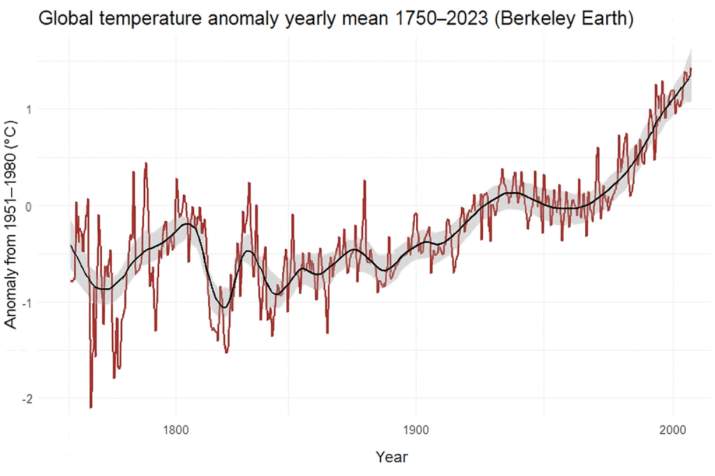
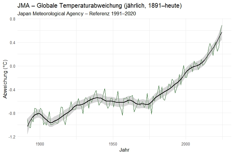
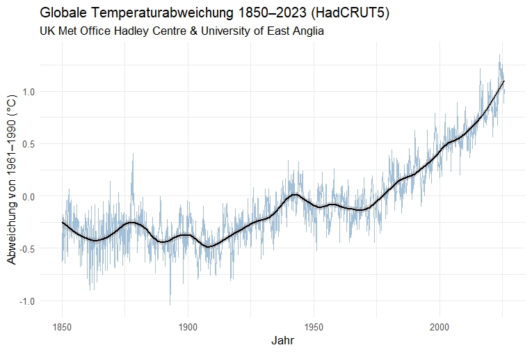
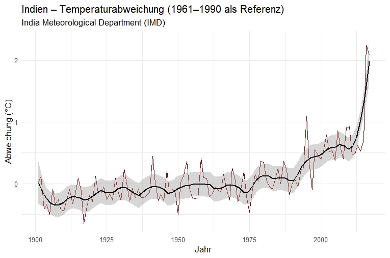
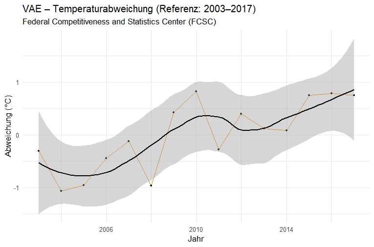
Of course, there are short-term fluctuations, cooler years, El Niño phases, volcanic eruptions, solar cycles. But the long-term trend clearly points upward. Whether you look at global averages, regional time series, or deviations from the reference period, the picture remains the same.
In scientific terms, this is called a temperature anomaly, a deviation from the long-term mean. It shows whether a given year was warmer or colder than average. And since the mid-20th century, those anomalies have been overwhelmingly positive. In other words: the Earth isn’t cooling, it’s warming. But temperature is only half the story.
If the planet is warming, the next question is obvious: Why?
This brings us to perhaps the most famous molecule in the climate debate, carbon dioxide, or CO₂. It’s invisible, odorless, and chemically unremarkable, yet it has a massive effect on the climate.
CO₂ is one of the so-called greenhouse gases: it lets sunlight in but traps part of the heat radiation that the Earth sends back into space. This principle has been known since the 19th century. But what really matters is how much of it is present in the atmosphere.
To find out, I analyzed the famous Mauna Loa measurements from NOAA. They have been conducted on Hawaii since 1958 and are considered the most reliable long-term CO₂ record in the world. The data are openly available, no estimates, no models, just real concentration measurements in parts per million (ppm).
But to make sure this trend isn’t just a regional phenomenon, I also examined two additional stations: Cape Grim in southern Tasmania (operated by Australia’s CSIRO) and the Zeppelin Observatory on Svalbard, about 1,200 kilometers from the North Pole (part of the European ICOS network). Both are located far from major industrial areas and serve as baseline reference points for their respective hemispheres.
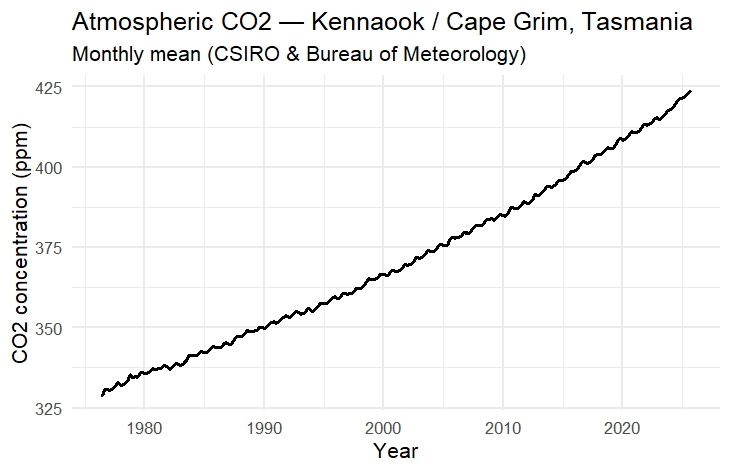
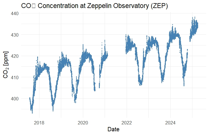
The result is unmistakable: all three measurement series – from the tropics to the edge of the Southern Ocean to the Arctic – show the same pattern. As global temperatures rise, the CO₂ curve follows almost exactly the same trajectory, only with an even steeper incline. Since the start of continuous monitoring, the concentration of CO₂ in the atmosphere has risen from about 315 ppm to over 420 ppm. And that’s not a small fluctuation – it’s a historic leap. Concentrations this high haven’t occurred for hundreds of thousands of years, as ice core data reveal (Lüthi et al., 2008).
It gets even more interesting when you overlay the two curves — temperature (e.g., Berkeley Earth) and CO₂ (here e.g., Mauna Loa). The parallels are striking. When CO₂ goes up, temperature rises too — not every single year, but in the long-term trend they match almost perfectly. And this holds true whether the data comes from the U.S., Japan, the UK, India, or the Emirates.
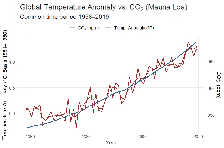
Of course, correlation alone doesn’t prove causation, but when a global rise in temperature coincides precisely with a global rise in CO₂, and when the physics of the greenhouse effect explain that link, it’s hardly meaningful to ask if CO₂ plays a role. The real question is: how much? That leads us to the final and perhaps most decisive question:
Where does all this CO₂ actually come from?
After all, Earth has always produced CO₂, through volcanoes, forests, oceans, even animals and decomposition. So why would humans suddenly make a difference? Again, the answer lies in the data. For this, I examined global emissions datasets from Our World in Data (OWID) — an independent, scientific project based at the University of Oxford.
OWID is run by economists, data scientists, and researchers who compile and curate international datasets from science, statistics, and policy and make them transparently accessible. Each year, they aggregate CO₂ emissions from all known sources, clearly separated by coal, oil, gas, cement production, gas flaring, and land-use changes (such as deforestation).
All CO₂ figures on OWID ultimately come from the Global Carbon Project (GCP), a consortium of more than 70 research institutes worldwide, including the Centre for International Climate and Environmental Research (CICERO) in Norway, the CSIRO in Australia, the Laboratoire des Sciences du Climat et de l’Environnement (LSCE) in France, and the Tyndall Centre for Climate Change Research in the UK.
These organizations produce the most comprehensive and methodologically verified CO₂ datasets available. They combine national emission inventories with atmospheric measurements and models to create a global carbon budget, a balance sheet showing how much CO₂ is emitted, stored, or absorbed by natural sinks like forests and oceans.

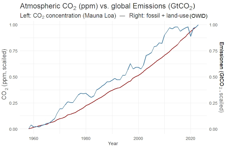
When you plot these values over time, the picture becomes clear: from the mid-19th century — right at the start of the Industrial Revolution — fossil emissions soar. First slowly, then exponentially. Coal came first, followed by oil and gas, and later by cement and industrial processes. Meanwhile, natural CO₂ sources like volcanoes or oceans remain nearly constant. Their influence is tiny compared to what humanity emits every year.
Today, roughly 90% of all CO₂ emissions come directly from human activity. And this trend is mirrored in the atmosphere: the rise in CO₂ concentration tracks almost perfectly with the growth of fossil emissions. Whenever production slows, during recessions or lockdowns, the curve briefly flattens, only to surge again even steeper afterward.
The data therefore not only shows that the climate is changing but also that the rise in temperature follows the rise in CO₂, and the rise in CO₂ follows our emissions.
Of course, the climate is a complex system with many interacting factors. But when you step back and look at the sum of evidence, a clear pattern emerges, consistent across all datasets, countries, and institutions.
In the end, there are no slogans left, no political spin – just numbers. And they tell a remarkably clear story. – by Maike Martina Heinrich – Nov 2025
References
Berkeley Earth Surface Temperature Project (BEST). Global Land and Ocean Temperature Anomalies. University of California, Berkeley Earth. Available at: https://berkeleyearth.org/data/
British Antarctic Survey. Ice Cores and Climate Change. Available at: https://www.bas.ac.uk/data/our-data/publication/ice-cores-and-climate-change/
India Meteorological Department (IMD). All-India Mean Temperature Series (1901–2024). Available at: https://mausam.imd.gov.in/
Japan Meteorological Agency (JMA). Global Surface Temperature Anomaly Data. Available at: https://ds.data.jma.go.jp/tcc/tcc/
Lüthi, D., Le Floch, M., Bereiter, B., Blunier, T., Barnola, J.-M., Siegenthaler, U., Raynaud, D., Jouzel, J., Fischer, H., Kawamura, K., & Stocker, T. F. (2008). High-resolution carbon dioxide concentration record 650,000–800,000 years before present. Nature, 453(7193), 379–382. https://doi.org/10.1038/nature06949
MIT Climate Portal. How Do We Know How Much CO₂ Was in the Atmosphere Hundreds of Years Ago? Available at: https://climate.mit.edu/ask-mit/how-do-we-know-how-much-co2-was-atmosphere-hundreds-years-ago
National Center of Meteorology (NCM), United Arab Emirates. NCM Climate Statistics, Abu Dhabi. Available at: https://www.ncm.ae/en/
NOAA Global Monitoring Laboratory (GML). Atmospheric Carbon Dioxide (ppm), Monthly and Annual Mean Values, Mauna Loa Observatory. Available at: https://gml.noaa.gov/ccgg/trends/data.html
Our World in Data (OWID) – University of Oxford, Global Change Data Lab. CO₂ and Greenhouse Gas Emissions Database. Available at: https://ourworldindata.org/co2-and-greenhouse-gas-emissions
UK Met Office. HadCRUT5 Global Temperature Anomalies. Available at: https://www.metoffice.gov.uk/hadobs/hadcrut5/
Photo: Markus Spiske, Unsplash
